A New Online Home for Design Faith Blog

I have moved the Design Faith blog to my relaunched website kennethcaldwell.com You'll be redirected there in 10 seconds.

Monday, January 31, 2011

Watching Over Point Lobos, Watching Over Us

Cynthia Criley Williams
November 1, 1915–January 29, 2011


Cynthia in August 2009

Cynthia Williams’ work, in the 25 years I knew her, was her web. And I don’t mean the electronic kind. She was like a friendly spider from some children’s book, catching almost everybody who wandered up the path to her ramshackle mid-century redwood house overlooking Point Lobos and the ocean. She could be a little aloof at first, but after you were part of the circle, her love was constant. But she wasn’t overly expressive. You just knew. When folks had problems with their parents, they could sit near the fireplace or on the wire ice-cream-parlor chairs and feel her special kind of unconditional love. On all but the rare warm days, there was a fire burning in the fireplace, and everybody was welcome for dinner. Some days there would be only a few, and other nights a dozen or more. Nobody really seemed to plan: Cynthia’s house was like Carmel Highlands’s very own special soup kitchen. Around age 90, she declared she was retiring from cooking and expected others to figure out how to stretch a dinner for two into a dinner for 20. And they did. You might sit next to a famous folksinger, an actor, a judge, an anarchist, a brilliant mathematician, a therapist, a technology millionaire, an out-of-work carpenter, a painter, or somebody’s nephew travelling from a faraway land. Generally, the dull didn’t stay.


Bird Rock at Sunset

Cynthia lived her life on the Monterey peninsula because her father, the painter Theodore Criley, settled in Carmel around the turn of the last century. He was the real deal, one of the original bohemians. His studio faced north for the light and looked west toward Bird Rock. Amazingly, the little wood building has not fallen off the cliff into Gibson Creek. Criley died young, in 1930, and the family sold off some of the parcels of the land overlooking the water. On the high point of the property that remained, Cynthia and her then-husband Russell commissioned a house from her brother, Ted Criley, Jr., a well-known Southern California architect. In this simple home, she brought up her family and helped an enormous number of wayward children of all ages. This most modest of modernist houses provided comfort and a roof to literally thousands of people. The living room was perfect for four or 40 if they spilled onto the terrace.


A typical evening

A few years ago, Cynthia was studying Greek to keep her mind nimble. As I grew portly in the last few years, she would nag me each time I showed up that I needed to lose a bit of weight. She softened the criticism by adding, “We want you around here for a long time.” In her last year, she said, “You look great.” I knew things had gotten fuzzy.

When I saw Cynthia in the fall of 2009, she spoke quite openly about death and said she wasn’t afraid of it. She treated it very matter-of-factly, the way she treated most things. She told a story about an out-of-body experience and said when she came to, she no longer feared death. I never heard her explore the mystical or talk about pop psychology, but she had some kind of faith in what was beyond the visible world.

Around Christmas 2009, she took ill and thought that was the end. Old friends flew in from all over, and the living room was full again. Cynthia rallied through Easter (always a favorite for generations of children looking for eggs). The built-in sofa in the living room was removed and a hospital bed was installed. The parade seemed to keep going. Even though she no longer recognized everybody in the room, she wanted to be where the action was. She wanted to go on experiencing the web she wove. She lasted another year or so, coming in and out of focus.


Cynthia with her presents


Cynthia with her daughter Molly and composer Paul Crabtree

This Christmas a complete stranger, a young man from Canada, wandered into the living room. After he’d learned he couldn’t camp at Point Lobos, someone suggested he ask if he could pitch his tent at the Williams’s. There was always an extra place for the unexpected wayfarer, and within minutes, he found himself first a guest of honor at a birthday party for our friend Laura and then, the next night, part of the regular Christmas eve caroling and eggnog party. He stayed through the holidays. Cynthia’s way continued even as she faded.

On Christmas Eve during a break in the caroling, I walked past the living room and ran into her son-in-law, Tom. He had been watching Cynthia through her bedroom window. The curtains were open to the view. He remarked how her shallow breathing was like the nearby ocean.

The constant presence of the sea’s rhythm smoothed out some of life’s tragedies. She shared this place and would always say, “It’s not mine. I am just a tenant here.” That was her business acumen showing at the same time as her spiritual side. I was lucky to know her. She was everybody’s favorite grandma.


The view from Cynthia's terrace

Friday, January 28, 2011

Verda Alexander: Artist & Designer In Dialogue

Verda in her studio
Photo: Jasper Sanidad

This morning Verda Alexander and her husband Primo Orpilla were named Designers of the Year by Contract magazine. They have ridden a few technology waves providing office spaces for all kinds of high tech companies. Their work often has a surprising edge, whether it is a form, a color, a mural. Part of that edge comes from Verda’s personal explorations as an artist. She moves between the functional and the aesthetic all the time. I thought it would be interesting to find out more about her work.

Q: What did you study in school?

I got a Bachelors in art, then a Masters in landscape architecture. After several years of practicing interior design I went back and got an MFA.

Q: Can you recount some of that process?

When I got my bachelors my heroes were artists like Michael Heizer, Robert Irwin, and Mary Miss. I was interested in earthwork artists and artists who engaged the public. I liked how Mary Miss used plywood and made these great geometric shapes in the landscape.

I thought that the way to follow that interest was to get an architecture or a landscape architecture degree. The portfolio I submitted for graduate school was all art projects that I had done at San Jose State. Then I got my landscape architecture degree, and it seemed like I'd gotten even further away from the art thing, because once you go down the practical and professional path you aren’t seen as an artist.

Verda with her husband and partner Primo
Photo: Jasper Sanidad

Q: Can you tell me more about that professional path?

The priority was starting and growing our business. That took most of my time for close to ten years. When the dot com bomb happened, I found myself with some extra time and thought, all right, seize the moment. So I went back for my masters in fine art at the San Francisco Art Institute.

Before that I was doing art on my own. When I was travelling I would be sketching nature, and then I started doing these little pattern drawings of the leaf patterns and repeating them. I was looking for pattern in the environment or some sort of motif that's taken from nature and used architecturally.

Q: Did you decide to reverse your emphasis and make art the more significant practice and have the design work be less important? Or were they influencing each other?

They were influencing each other, but I didn't realize that they were. At first I wanted them to very be separate. But after getting my MFA, I thought, well, at some point it would be great if they did come together. For example, I could design patterns for a carpet company. But there are very few who can blur the line between art and design like Jorge Pardo. I don't know if I want to do that exactly, but it's an interesting idea.

Verda's studio work surface
Photo: Jasper Sanidad

Verda's sculpture on table
Photo: Jasper Sanidad

The Orpilla/Alexander Living Room
Photo: Jasper Sanidad

Q: So talk about some of the things you started to explore when you were at the Art Institute.

My first projects had a lot to do with my landscape architecture -- I guess studies would be the best way to put it, like thinking about notions of the picturesque and landscape architecture history and trying to incorporate those in my art.

I made a garden fountain that had a virtual component and a sound component. I was interested in playing around with, how you might create public art, but more subtle public art, where you'd be walking and you'd hear something or you'd see something in the landscape, but it was very subtle. I created a Mary garden.

Q: A merry garden?

A Mary garden, which is a medieval garden form type, a garden that's based symbolically on the Virgin Mary.

Nativities
Courtesy of verdaalexander.com

Q: Where was this?

It was installed inside.

But I got frustrated, because it was like two layers -- first of all, art is difficult to understand, and then you've got all this landscape history that nobody knows anything about at all.

So I took away the layers. What I found was that I was really interested in a lot of the forms, the architectural shapes and forms, motifs, and, again, pattern. Many of them remained consistent over time. I took those shapes or patterns or motifs and mutated them or abstracted them and then transformed them into some other form. You could tell what they were, but it was actually a completely new and almost, futuristic shape or motif.

Q: Can you give me some examples?

I took some medieval window moldings in profile and put them in a 3D architectural program and rotated them on the axis so they were 3D objects. And they were just bizarre. You couldn't put a finger on exactly what they were. They could look like bombs and baby toys at the same time. But they started as an architectural feature from the Middle Ages and ended up looking quite futuristic.

I found that the idea of a picnic, which was probably a17th century idea, had several motifs to work with like the checkerboard cloth, and fleur de lys. I took it from a two-dimensional shape and made it three-dimensional installation. I was reimagining a flat still life.

The Picnic Installation
Courtesy of verdaalexander.com

Medieval Mouldings Installation View
Courtesy of verdaalexander.com

Victoria's Desk
Courtesy of verdaalexander.com

Q: And making the still life less still?

Yes. I love history, architectural history, and landscape architectural history. I took one of Thomas Jefferson's round buildings and extruded it and turned it into an art piece.

Recently I have been working with more mundane things like hazard stripes and traffic stripes and turning those into sculpture. You can tell where it came from but again, you get something radically different.

Run A Way
Courtesy of verdaalexander.com

Freeway Sign
Courtesy of verdaalexander.com

Q: First tell me about the project I saw on exhibit about Brittany. Architecture, interior design, and place seemed like significant influences there.

I was in Brittany for about two weeks, and I researched where people lived and how many of the homes were laid out in a similar manner.

Q: Were these fishermen’s homes? What century were they?

The 17th, 18th, and 19th centuries. And they hadn't changed over the years, in a lot of cases. They belonged to average people.

Q: What was the project?

I recreated the logic system of the furnishings. I maneuvered to certain shapes – most if was furniture, including tables, beds, and wardrobes. They didn’t have chairs, they all sat on benches. I looked at every house plan and created volumetric sculptures. They had a modernist feel to them. But nobody got the historical component, which is fine.

Q: The origin may not matter.

Brittany Homes
Courtesy of verdaalexander.com

Goethe's House
Courtesy of verdaalexander.com

Q: Your more recent work seems to be about more contemporary American settlements. They are like puzzle pieces of city life.

I worked with the skyline you see at night. I did all kinds of abstractions of a building window grids. I silk-screened them onto a kind of stiff paper. I glued them into an assemblage sculpture. It’s called “Berg.”

Berg
Courtesy of verdaalexander.com

Q: Like a town in Europe?

And an iceberg, because it looks like a crazy city growing out of an iceberg. It also reminds me of ‘40s graphic novels.

I also love airports and all the markings. I've been playing with and studying airports and redrawing different airports. And what I ended up finally coming up with was taking the center stripe of a roadway and creating a logic system for how I'd construct these pieces. A box with an end, a telescoping kind of idea, but it's rectangular, and just making them over and over again, and connecting them with the stripes so once it's done, it’s trying to warp it to its extreme.

Control Tower
Courtesy of verdaalexander.com

Hut for Ro Cham
Courtesy of verdaalexander.com

Q: So you're warping cardboard?

A box made out of cardboard.

I put them together and stencil on the stripe. And so it would go from big to small, to small to big. And I'd make them whatever lengths I wanted. And then I'd twist them and turn them and tweak them, and it became kind of this crazy, three-dimensional roadway system.

Q: Are you controlling the chaos?

No. The crazier the better. And really, the limitations are just the materials, and how much I could work and tweak them.

Q: How did you know when you were done?

Well, I might never have finished. It was whenever I ran out of time. So when I installed the piece at the San Jose Museum of Art, I just made them until my deadline, till I had to ship them over there. I had three days to install it, and I worked on it till I was out of time.

Q: So does it matter if you ever sell any of these?

No, because I have my day job, which most artists do.


Orpilla/Alexander Home
Photo: Jasper Sanidad

The artist walks from her studio to her living quarters.
Photo: Jasper Sanidad

Q: Does that free you to then make something that doesn't have to be marketed or commodified?

Yes. Or archival. One of the original runaways, that’s what I call the road pieces, broke in the heat. The glue melted on a hot day and it collapsed!

Q: How has your young son Apolo been influenced by your being an artist?

He has a very broad idea of what art might be; he never dismisses anything. Some of the best moments at the last Venice Biennale were with him. We had just left one of Scarpa’s buildings and we walked into this plaza where somebody left a bunch of toys to ride in a little group. They were fairly far apart from each other in this weird perfect circle, but Primo and I hadn’t noticed it. Apollo saw it and he was absolutely positive it was a work of art.

For more information:

www.verdaalexander.com
www.contractmagazine.com

The Toys in Venice

Wednesday, January 19, 2011

Alexander Girard: Deep Modernist. A Conversation with Ruth Keffer

One of Ruth Keffer's hand-drawn patterns

A few years ago, my friend the architect and NorCalMod author Pierluigi Serraino took me to see a house designed by Don Knorr with interiors by Alexander Girard. It was almost perfectly intact despite being 40 years old. Girard’s exuberance fit perfectly into a timber Miesian dwelling. We suggested that it might make a great story for Interior Design. A few months later, Eric Laignel photographed the project, and Edie Cohen authored the article. You can see it here at http://www.interiordesign.net/article/484672-Welcome_to_1969_pix.php?intref=sr.

(For the online version of the issue, Pierluigi and I had our own conversation, which you can see here: http://www.interiordesign.net/article/483940-Conversations_with_Pierluigi_Serraino.php?intref=sr)

Front doors designed by Alexander Girard
Photo by Eric Laignel
courtesy Interior Design magazine


Photo by Eric Laignel
courtesy Interior Design magazine

More than 20 years ago, I visited the Museum of International Folk Art in Santa Fe and was dazzled by Girard’s collection and display. When I lived in Los Angeles, my friend Elaine Jones gave me a few samples from the years she worked with Girard, George Nelson, and Charles Eames at Herman Miller. These little pieces of fabric are among my favorite mementos.

But somehow I missed the exhibit at SFMOMA in 2006–2007. Recently I was having lunch with Ruth Keffer and found out that she was involved in the show. Looking for any excuse to talk about Girard, I asked her some questions. Her answers give us some further insight into the legendary designer.

Girard exhibit entry
Photo: Ruth Keffer

Entry sign on freight elevator
Photo: Ruth Keffer

Q: What was your role in the Girard exhibit?

I was the curator. That role fell to me because Joe Rosa [SFMOMA’s curator of architecture and design] had decided to move to the Art Institute of Chicago in 2005, so his exit timing became my opportunity. Most of the pieces in the show were accessioned by Joe, except for the Three Passenger Sofa and the La Fonda Chair, which the museum had acquired during the Paolo Polledri era. The pieces that Joe accessioned all came from one donor, a local collector named Carl James, who had been the manager of the Herman Miller showroom in San Francisco back in the day. Carl had lots of textiles, obviously, and many pieces from the La Fonda del Sol restaurant in New York, and a cache of ephemera that mostly wasn’t in the show but resides in SFMOMA’s library archive.

The exhibition was intended as a showcase of that accession, with a few other pieces thrown in. It was small, but there was enough for me to create what I felt was a meaningful survey of the high points of Girard’s career: Herman Miller and the textiles, the work for Braniff Airlines, La Fonda, and a smattering of graphic design.

Girard patterns Photo: Ruth Keffer

Girard exhibit title wall
Photo: Ruth Keffer

Girard exhibit gallery
Photo: Ruth Keffer

Gallery exhibit detail
Photo: Ruth Keffer

Q: Did you know about Girard before you started working on the exhibit?

More or less. Mostly less. I think I lumped him in with the other biggies of midcentury design. I knew more about Herman Miller in general than I did him. When the Cooper-Hewitt, National Design Museum did their show in 2000, I remember being very excited to see the images from that exhibition (although I never got to see the show itself), because I’m a huge textile fanatic. But I was still not processing who he was in relation to the company or to Eames and Nelson, or his real stature as a designer. And it’s funny, because I think my confusion had something to do with the way we think of textile designers as a step or two below furniture designers, who are a step or two below proper interior designers, who are a step below architects.

Photo: Ruth Keffer

Photo: Ruth Keffer

Fabrics with three passenger sofa
Photo: Ruth Keffer

Three passenger sofa with pillow
Photo: Ruth Keffer

Q: Had you been to Santa Fe to see the Museum of International Folk Art?

I had not and have not seen the MoIFA. But I have studied Girard’s work there—the layout of the collection, the contents of the collection, his philosophy of taxonomizing things, etc. And that is where I run into trouble with my easy analysis of Girard, for as much as one can rhapsodize about the extraordinary innovation of his textile designs, when it came to his relationship to folk art itself, to the objects that inspired him as a collector and an artist, he was rather formalist. Or should I say, strictly formalist. He had no interest in cultural anthropology. No interest in folk art as a domain of academic inquiry, and likely no awareness of questions about appropriation or imperialism or any such thing. Up until I started looking at the MoIFA work, I had been thinking of him rather breezily as the father of postmodern design, the first to embrace non-Western influences and celebrate outsider art. But now I’m inclined to think he really didn’t have that kind of vision. What I do think is that as an artist he had a keen attraction to and a sensibility for other artists’ work, for their craft, their color sense, for their own joy present in the objects they created. And I think that’s what made him such an obsessive collector. (Truly obsessive!) And it’s no wonder that toys were his principal passion as a collector.

Photo by Eric Laignel
courtesy Interior Design magazine

Photo by Eric Laignel
courtesy Interior Design magazine

Photo by Eric Laignel
courtesy Interior Design magazine

Photo by Eric Laignel
courtesy Interior Design magazine

Photo by Eric Laignel
courtesy Interior Design magazine

Q: Even if Girard didn’t have an interest in the larger philosophical or political aspects of collecting, don’t you think he saw cultural threads?

Definitely he saw cultural threads. I think he was always looking for, and firmly believed in, the idea of cultural commonalities, of the Family of Man. One of those commonalities is the idea that physical objects are vessels for memory and feeling. Girard thought this was a crucial idea to remember and incorporate when designing a space, but he thought that modernism, as a design agenda, had left this notion behind, to its detriment. Ironically, modernism was looking for a way to be global and cross-cultural, but by being abstract. So it’s effacing all those elements that have culture-specific, or what could be defined as narrative, references. But for Girard, storytelling was the whole point, since it is the core activity of every culture. Design is storytelling, and design elements—whether objects or motifs—are dramatic players in the “theater” that one creates when designing.

Photo by Eric Laignel
courtesy Interior Design magazine

Photo by Eric Laignel
courtesy Interior Design magazine

Photo by Eric Laignel
courtesy Interior Design magazine


I got very excited by this idea when studying Girard, because it’s the same rhetoric that Kandinsky used when describing his compositions and his relationship to the elements in his work. It is formalism, but it’s not superficial or lacking in political relevance, as the academics would argue. It’s a search for, and a celebration of, something deeper and more immediately human. In the case of Girard’s geometric patterns, the forms are not really abstract but abstract-ed—each adapted from their original context to serve a specific two- or three-dimensional design context, such as the folds of a curtain or the contours of a chair. So the feathers on the surface of an Incan ceremonial cloak become the repeating pattern of the 1957 “Feathers” textile, and in each case the feathers are both a formal and a narrative element, wielded deliberately by the artist for evocative purposes.
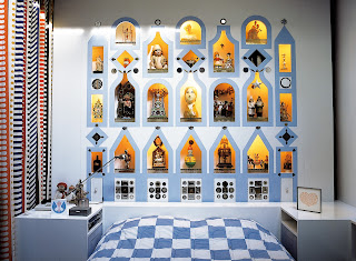
Photo by Eric Laignel
courtesy Interior Design magazine

Photo by Eric Laignel
courtesy Interior Design magazine

Photo by Eric Laignel
courtesy Interior Design magazine

Q: Do you think that George Nelson ends up raising Girard and thus other textile designers to a much higher level of appreciation?

It’s really hard to say when this happened or if it really happened at that time. It’s true that Eames and Nelson and other designers who worked with Girard spoke openly about their reverence for him—he was considered the true genius with instincts they envied. He was prolific and aggressive and very confident. (At one point he was also called a “design automaton.”) And he embodied the Bauhaus principle of the Gesamtkunstwerk, creating the total design environment as an architect, interior designer, and textile designer.

Photo: Ruth Keffer

Photo: Ruth Keffer

Q: Do you feel that you got to show that sense of the Gesamtkunstwerk in the exhibit at SFMOMA?

I certainly tried to, though it was a challenge given the limited number of pieces we had to show. But I thought I touched on his holistic approach in each of the various projects: the way the Herman Miller textiles work with the furniture; the idea of a totally branded environment for Braniff; and for La Fonda del Sol, a complete design package: graphics, tableware, fixtures, the space and light of the interior.

Photo: Ruth Keffer

Checkerboard cloth
Photo: Ruth Keffer

La Fonda del Sol tableware
Photo: Ruth Keffer

Q: Girard has been getting a fair amount of attention these last few years. But his works were not always popular?

In the 1950s and through the Kennedy era, his patterns did not sell well. He could not convince Herman Miller customers to surround themselves with cheerful, playful patterns at the same time they were purchasing minimalist furniture. The Textiles and Objects store—where Herman Miller sold folk art objects alongside the textiles—was a failure.

Photo by Eric Laignel
courtesy Interior Design magazine
Front door detail

Photo by Eric Laignel
courtesy Interior Design magazine

By the time he left Herman Miller in 1973, though, the situation had shifted. The hippie culture embraced non-Western influences, and Pop artists had been doing their thing, and Girard started to look prescient. Designers who followed Girard’s lead in borrowing motifs from other cultures were selling, and they were getting attention as designers. But I think Girard recognized that this new trend, and the growing celebrity of designers in the mainstream culture, had everything to do with marketing and the search for novelty and little to do with his heartfelt quest to plumb the mysteries of the human condition. He remarked, in an interview in 1974 with the curators of a Herman Miller show at the Walker Art Center, that he had recently gone into a Miller showroom in New York and been dismayed by what he saw, or didn’t see, there. He said, “There’s no more religion.”

Girard chair in front of Girard fabric
Photo by Eric Laignel
courtesy Interior Design magazine

Photo by Eric Laignel
courtesy Interior Design magazine

Which I think reveals the way in which Girard truly was a modernist himself — he believed that design should serve the greater good.


Photographer Eric Laignel and Interior Design editor in chief Cindy Allen graciously loaned the photos from the story that ran in Interior Design.

For more info:

www.ruthkefferdesign.com
www.ericlaignel.com
www.maximodesign.com/
girard.houseind.com/
www.internationalfolkart.org/about/girard.html
www.interiordesign.net


One of Keffer's digital patterns