|
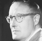
Squeak Carnwath
© 2009 Peg Skorpinski |
I met Squeak Carnwath in the early 1980’s through her husband, architect Gary Knecht, who belonged to the same preservation group I was in. Gary and Squeak lived in Alameda in a rambling Victorian full of Squeak’s work. The confusion was wonderful.
Over the years, I’ve followed Squeak’s work at John Berggruen and elsewhere. Sometime in the ‘90s, I bought one of the early prints she made at Paulson Press, entitled “Pysch 101.” The Dick & Jane characters spoke to me from childhood.
In April 2011, I interviewed Squeak at Paulson Bott Press as she was finishing four new prints. Our conversation turned to painting and teaching. Although her loyal dog, Vermeer, kept vying for attention, Squeak had no trouble concentrating on the topic at hand.
Interviewer: Do you paint every day?
Carnwath: Yes.
Interviewer: Even while you travel?
Carnwath: Well, it depends. I had a little travel book that I filled while on a three week train trip in Russia. I'll do it on a long trip like that, but if it's a short trip, no.
Interviewer: Do you think you'll ever go back to ceramics?
Carnwath: No, not at all. I don't want to make sculpture. I love sculpture but it’s too real, it’s something you can bump into. I'm on a mission to prove that painting is the queen of the arts.
Interviewer: What do you mean?
Carnwath: I think that painting is a philosophical enterprise in that people believe that what they’re seeing is a real thing, even if it's abstract. In other words, even though it’s just a thin film of paint on a flat surface, people believe in a painting’s reality. Even a Rembrandt portrait is on a flat surface.
Painting is not 3D, like sculpture. You can't walk into it, you can't pick it up. You have to make that leap that what's happening on the surface holds some kind of reality you're willing to believe in.
 |
Ideas, 2009
Oil and alkyd on canvas over panel |
 |
Sampler, 2010
Oil and alkyd on canvas |
 |
Like Science, 2009
Oil and alkyd on canvas over panel |
Interviewer: But I would say your painting is questioning reality all the time.
Carnwath: It’s questioning a different reality, though, like the reality of how we navigate the world. Is that real, or is that all in our imagination? Maybe it’s more of a Buddhist line of questioning: Are we actually occupying a body, or are we all an illusion?
To me, painting is about this line of questioning, rather than replication or illustration.
Interviewer: Your paintings contain a luminescence.
Carnwath: Yes. I strive for that. It’s one thing you can't get with printmaking, where you’re dealing with the available light of the paper, which is already there. It’s what lends the print luminosity. But prints are always going to be flatter, and be more graphic—they have lines, and drawing.
They will never be like a painting. In a painting, there's no available light. You have to build light. You can’t do that in printmaking, unless you do a monoprint, but then you're basically doing a painting.
 |
Marked, 2010
Oil and alkyd on canvas over panel |
 |
Painting Is, 2010
Oil and alkyd on canvas |
Interviewer: Do you find that frustrating?
Carnwath: Just different. And it proves my point that painting is the queen of the arts.
Interviewer: What would be the king of the arts?
Carnwath: There is no king. It's only a matriarchy. There's no prince, either.
Interviewer: There are prints, but no prince!
Carnwath: That's right.
Interviewer: You retired from teaching, correct?
Carnwath: Yes, but I'm volunteer teaching a painting class at Berkeley in the fall. I also work with some grad students. I told the department I would volunteer if they needed me to because the department has no money. They can use that money to do something else if they get me for free.
Interviewer: What drew you to teaching for so long?
Carnwath: I needed to make a living while being able to do what I wanted in the studio. Teaching allowed that. And it helped me develop better social skills. I'm basically really shy, and teaching has helped me become less shy and introverted.
Also, I wanted to teach people things that I was never taught. When I was starting, I always heard people talk about how painting is all about light, but nobody really described what that meant, in terms of how you did it, or its philosophical value. I wanted to be able to impart valuable knowledge that I have learned along the way. I would do painting demonstrations and assign projects based on techniques used by painters like Rembrandt, and then combine techniques in the assignments.
I also wanted to encourage people to be more brave so that they could do what they wanted to do, whether as an artist or as something else.
Interviewer: Have students changed over the years?
Carnwath: Students are less creative than when I started teaching.
Interviewer: Why do you think that is?
Carnwath: Because their parents are helicopter parents. Kids haven't wandered around and gotten lost because everybody is worried about them getting kidnapped. And also they are more risk averse. They are afraid to fail or make mistakes. Art making is all about making mistakes to come to something successful.
Interviewer: And the technology they grow up with?
Carnwath: They don't learn how to do things. Or they learn how to do things so well that they just copy, and want people to like what they do. It's not interesting.
Interviewer: They want approval?
Carnwath: Approval is really important to them. If they show a skill set, even though it's not serving them, they want to hold on to that skill set instead of realizing that it’s just a means to an end, a way to further enhance or develop a conceptual idea.
 |
A Little Crazy, 2010
Graphite, pastel on paper |
 |
Face Recognition, 2010
Oil and alkyd on canvas over panel |
Interviewer: Do you talk to them about your personal stories?
Carnwath: Well, I sort of feel like my life is everybody's life, and my particular stuff is not that different from how everybody else feels. My story is the way for the viewer to access their own story.
Interviewer: So when we see things in your work like a map of the heavens or quarters or Dick and Jane…
Carnwath: Yes. It transports you to something in your own past or narrative. One of the great things about artwork is that it’s personal. Even if somebody's doing still lifes, the way they touch something is unique.
But you have to be careful because some of it's tricky. For example—and I'm going to get in trouble for this—I can't stand the touch of Gerhard Richter's work. I think it's cruel, the way that he makes the felt surface, it is the way he handles the paint, the way he makes his art. To me the feeling of his paintings is mean spirited. To me his paintings lack empathy.
Interviewer: As if the human being wasn't there?
Carnwath: No. I think it's a cruel human being that is there.
Interviewer: That’s interesting because I’ve found that his dexterity leaves me cold.
Carnwath: Me too. I went and saw his work twice in New York, and two, maybe three times in San Francisco—and really felt like it was oppressive. It just creeped me out.
Interviewer: There was a kind of Aryan perfection.
Carnwath: Yeah. I really hated it. There are things I love about his work, for instance, in the Baader-Meinhof series. There’s something about the struggle of the people involved in that work. And the beautiful tender paintings of the typewriter or the roll of toilet paper.
Interviewer: There's ambiguity.
Carnwath: Yes, there's a little ambiguity.
Interviewer: But there's not much ambiguity in his other work?
Carnwath: Take, for instance, the Speck murders. I thought it was really, really repellant to me the way he was using something to manipulate the viewer in some way while blaspheming these dead nurses. It pissed me off. I'm one of the few people who don’t like him; most everybody I know thinks he's great.
Interviewer: Well, I came away from that show just annoyed, but I didn't know why.
Carnwath: You should pay attention to that.
Interviewer: Yeah. Did you see the small Eva Hesse show at the Berkeley Art Museum?
Carnwath: I love her work. It's fabulous, it’s so intuitive. It tries to find the name in the object or the heart in the object or whatever you want to call it. She is trying to uncover something and doing it in a really elemental way. Her pieces are beautiful.
Interviewer: Are you encouraging students to access their own narrative?
Carnwath: Yes, I think that's really important. It could be totally abstract, like Anne Appleby or Robert Ryman, whose work is driven by his interest in what material will do to a single color. I love his work. It doesn't have to be recognizable imagery.
 |
Fenestration, 2010
Oil and alkyd on canvas |
 |
No Proof, 2010
oil and alkyd on canvas over panel |
Interviewer: Do you feel like you have so many ideas that you don't have enough time to paint all the paintings you want to paint?
Carnwath: I don't have that. I'm fairly patient. I hope I have enough time. I figure I must.
Interviewer: How do you keep track of all your ideas? When we spoke about your prints you mentioned that you like to get all your Artist Proofs up front. That’s pretty organized.
Carnwath: When I did the Chronicle book, we worked a lot on the arrangement. We started organizing the paintings, the slides, everything, in a database.
Now, I have everything from the beginning organized in binders. I keep all the notes that I write about paintings in their binder page. I have drawers full of these binders. Sometimes, I will frame the pages and keep them in a suite of drawings.
In addition to the print archive, I have also archived the studio notebooks I’ve saved, with all the little weird notes and scrawls. I just save all this stuff.
Interviewer: Where will it end up?
Carnwath: I would like to find a place to sell it to. Now, all my stuff in the building is going into something called the Artists’ Legacy Foundation, which I started. When I started it, it was going to be the Squeak Carnwath/Gary Knecht Foundation, but Viola Frey said, "Well, can I be a part of that?" I said, "Sure," and then realized we had to have a general name for it so that other artists could put their work and estates into it. Then, the foundation can manage their estate and give cash awards to other artists to do their own work. Anyway, Viola’s work is in the Artist Legacy Foundation now.
Interviewer: We haven't talked very much about her. She was a great ceramic sculptor. Did you two have a dialogue about this queen of the arts idea?
Carnwath: No. I think I came to that later, maybe even after she died.
Interviewer: How did she encourage you?
Carnwath: Around ’68, I showed up at CCAC to look it over after I'd been over to look at the Art Institute. At the Art Institute, everybody was really cool— they wouldn't talk to you or say hi or anything. Things were closed.
But at CCAC, building doors were open and you could wander around. I wandered into the ceramic studio because I'd taken some ceramic classes and had every intention of continuing to take classes. I found this woman loading a kiln. And we just talked for three hours.
By the time I left, I had decided I would go to CCAC. So I went to register. Back then they didn't have computers; the faculty set up card tables for each department in painting, print making, and ceramics etc.. You'd go talk to one of the teachers in those departments and they would put your name on the list for whatever class. The chair of the ceramics department, Vernon Coykendahl, was manning the card table. He said, "No. There're no classes left. We're all full… but go talk to that woman over there." I look over, and it's Viola, so I go over to talk to her, because I thought she was another student. She said, "Yes. I saved three classes for you." I signed up and took those classes.
Viola always encouraged me by making sure certain opportunities were available. She let me into grad school without an undergrad degree. I had dropped out, and I still see no reason for an artist to get an undergrad degree; the only thing it's going to do now is get you into grad school, and we're cranking out way too many grad students. Liberal arts education can make someone a better critical thinker and problem solver and those abilities are good for life and for art making.
But, I wouldn't have been able to teach if Viola hadn't let me into grad school. She gave me other opportunities as well; she would let me work in the studio during Christmas break.
Interviewer: Did Viola encourage you to pursue the personal narrative?
Carnwath: The first thing I did in grad school was write a series of stories about different towns and cities that I'd lived in as a child that had influenced my becoming an artist.
They were called the “I Stories.” I recorded them all and made a record that would tell you when to turn the pages. I had Viola and Charles Fiske come listen to it. They were encouraging. She never was discouraging.
But when I was in grad school, she was also not very verbal. She would say, “you know, on the thing, on the thing.” That was the extent of her critiquing.
Interviewer: On the thing?
Carnwath: Yeah. It was the weirdest phrase. She would grunt and point. I'd go, "Yeah. Okay. Fine. Yeah." For some reason, it made sense to me. I can't even say why.
After Viloa had a stroke, a bunch of us took her to the neurologist They did an MRI, and they saw that she had had in the past, maybe years before, a brain stem stroke, which she didn't know anything about. When she was saying “on the thing,” it could have been that she had already had the stroke pictured in that MRI.
Interviewer: It seems that Viola was a teacher by example, not by complex theory.
Carnwath: No. Her teaching wasn't complex. But it wasn’t simple either. She was very bright and complicated. In fact, she didn't even finish her MFA, but nobody knew that until after she died. So in retrospect, it made sense that she let me into grad school without the undergrad degree.
Interviewer: Did the recent survey show at the Oakland Museum feel like a painting memoir of your work?
Carnwath: No. I have these sheets of paper that live next to my paintings that serve as their memoirs or diaries.
Interviewer: You mentioned those earlier. Explain them to me.
Carnwath: Well, I keep little notes next to my paintings to remind me of what I want to do next, or I write something down that's going to go in there that's not ready, or that I've painted over and I want to put it back in. It is like a memoir of the painting. I think of the papers as the crazy papers because of the way they look, with crude drawing and scrawls. For me they are my drawings.
Interviewer: But when you see a group of paintings, they don't feel like a memoir of your life?
Carnwath: No. I don't see them like that, I just see them as individual objects that I experienced and worked on but that are part of a bigger picture or a larger process. I mean, it would make sense given what's in the paintings.
Interviewer: Does it bother you that when your paintings are purchased you will never seem them again?
Carnwath: No.
Interviewer: It sounds like you document them fairly well.
Carnwath: I document, but when I finish a painting, I finish it. That's it. I let it go. I keep paintings, but I don't keep paintings until they've been out, and people have had a chance to see them.
Interviewer: Either in a gallery or in a show?
Carnwath: Yes. Sometimes, they go to different galleries, so there are many chances for people to see the piece. Then, if I'm lucky, the one I really want comes back. I have those paintings that I hoard.
Interviewer: When you saw the Oakland Museum exhibition were there surprises?
Carnwath: I was surprised by how well it worked together, and that the paintings held up. That was surprising to me. I don't know why.
Interviewer: In other words, you saw a thread?
Carnwath: There were things that I have abandoned, techniques for instance, that I thought I would pick up again, but I don't know if I actually have. There were things that had evolved into something else that I could revisit and use again.
Interviewer: Revisit?
Carnwath: Maybe on some level, but not entirely because I like to move forward. I don't like to go backwards. When I'm done, I am done. And I don't like to fix paintings either—in fact, I really dislike fixing paintings. It's like being thrown down a dark hole.
Interviewer: You mean, if it's damaged?
Carnwath: Yeah. I don't want to fix it. I’ll get a restorer. If I start scraping it off and go down to the bottom, I'll have to start all over again.
Interviewer: And that would be a different painting.
Carnwath: Yes, and I don't want to do that. It’s in the past. It's not the present.
 |
Thought and Pleasure, 2010
oil and alkyd on canvas over panel |
All painting images courtesy Squeak Carnwath.
For more information please visit:
www.squeakcarnwath.com
www.berggruen.com
www.artistslegacyfoundation.org
www.paulsonbottpress.com