A New Online Home for Design Faith Blog

I have moved the Design Faith blog to my relaunched website kennethcaldwell.com You'll be redirected there in 10 seconds.

Wednesday, April 27, 2011

A little break to Patmos

An Island Sanctuary: A House in Greece
by John Stefanidis

I have been reading a lot about the writer Bruce Chatwin recently. One of his many obsessions was the idea of the nomad. He imposed a nomadic life on himself, unable to stay in one place for very long. He was always in search of the perfect place to write. But he would stay a month and get bored. He found one such place in Greece with a friend from his time as art expert/wunderkind at Sotheby’s, Teddy Millington-Drake, and Millington-Drake’s partner, the interior designer John Stefanidis.

Teddy Millington-Drake's former studio is now a guest bedroom

The garden

Their home was on the island of Patmos in Greece. In 1964, they bought a run-down house below the monastery of St. John in a village called Chora for the sum of one thousand pounds. Now it would probably cost that much to order a new slipcover for one of the chairs.

Dining room

Last year Rizzoli released Stefanidis’s book about the house entitled An Island Sanctuary: A House in Greece. Most of the time, I give these books a pass, as they are an excuse to promote an interior designer’s oeuvre and are not much more than a hardbound shelter magazine printed on thicker paper. But in this volume, the images by Fritz von der Schulenburg and the text by Stefanidis and coauthor Susanna Moore tell a richer story of a region from the terraces, rooms, and gardens of one home. Perhaps interior design reaches its apogee when it feels like there was just a light touch. Like the Bay Area architect William Wurster wanting his houses to feel like a very talented carpenter built them. So it is with Stefanidis’s house; it feels like an erudite collector stored a mix of indigenous materials carefully in a rambling white cave. It’s worth a break.

The view from the upper terrace toward St Johns monastery
as painted by Teddy Millington-Drake

Shawls to keep warm

All photos courtesy Rizzoli. 

Friday, April 22, 2011

It’s Easter and I have a secret: pink.


Pink is my favorite escape color.

When I was a kid and older people asked me, “What is your favorite color?” as a way to make conversation, I always answered, “Red.” Bold, distinct, a little revolutionary, different from what other little boys replied. But like your name, or your athletic ability, it seemed permanent. When I started my own business, I decided red was too much of an architect cliché and went for orange. And over time I have favored Pantone 021 in all kinds of things. My favorite hotel beach towel is the same shade.

Mark Rothko
The Museum of Contemporary Art


Hotels have a way of claiming you. If red is like my birthright favorite color, orange is my modern business favorite color. But my favorite holiday color is actually pink. Pink is like a vacation or a confection. It’s an occasional affair, not an all-the-time color.

Hotel Bel-Air
Las Brisas, Acapulco

Our favorite regular hotel (that we can afford) is the Arizona Inn. Its pink is deep, inspired by the colors of the desert that used to be right next door. But I also like that silly, lighter, luxury pink of LA’s Hotel Bel-Air. I have to be honest, I have never stayed there. But my friends Wendy and Ira got married there, and another friend had her first honeymoon there. When I lived in LA, I went for drinks there as often as possible. A few years ago, buddy Kenwood and I went for drinks and snacks when we were in LA for the AIA convention. Not another architect in site! The fire burned in the lounge no matter the time of year. It was always a world apart. You had no idea you were in LA. Even an hour spent there is an hour on a special mission. Another friend, Jon, is involved in the renovation, and it should look even better when it reopens later this year. Perhaps the owners will invite design bloggers on a special tour. A few miles away, the Beverly Hills Hotel on Sunset Boulevard is also silly pink, but that place always seemed a little exhibitionistic, a little too preening.


Arizona Inn

Arizona Inn

Arizona Inn

In sixth grade, we did a report on Mexico. We had to research travel, and of course our little team chose Las Brisas in Acapulco. Every casita came with its own pool. I have never been to Acapulco, but I loved the idea that the jeeps that climbed the hill to your room used to be pink. The gift shop is called the Pink Shop. Another favorite is the Royal Hawaiian on Waikiki. If you don’t look too hard, you can imagine it’s before Pearl Harbor and high-rise development. The recent renovation makes you feel like you are holding down the last remnant of grand era. I have to say your skin looks better under a pink umbrella. My three days there a few years ago were just bliss.

Royal Hawaiian entrance

Royal Hawaiian

Royal Hawaiian pool

Royal Hawaiian

Back in San Francisco, at the corner of Taylor and Sacramento Streets on Nob Hill, there is a slender tower that used to be pink. Many years ago, it was painted beige. I suppose it fits into the city better, but it lost its identity. It’s not special any more. I wish it were pink again.

Happy Easter!

The author in a pink shirt, which he wears occasionally.

Wednesday, April 20, 2011

Swinging Against Competition

Building at the Headland Center for the Arts

Went to the Headlands Center for the Arts Open House on Sunday. The lot was full, and I parked outside the old gym. I wandered in and saw ten people swinging. Five on each side facing each other. Heavy rope reached far above our heads, bolted into the ceiling. Unlike the chain swings of childhood, these seemed to swing more slowly. Instead of yelps of delight, there was mostly silence.


The artist, Paolo Salvagione, entitled the piece “Competitive Swinging.” His beautiful letterpress explanation says, “It lifts the curvilinear markings from the floor and renders them in space. And it renders them with the weight of the seated human body. It sets five of these bodies against another five, two rows of nearly invisible bleachers suspended in the air. Each body traces a pendulum in the air, ten flesh clocks marking time.”

As a child, I hated physical education class, except that I could run very fast. Beginning in elementary school, I advocated against games, saying that competition led to war. What the artist accomplished here, whether he intended to or not, was a slowing down, a victory over competition, an event where everybody contributed by moving independently.

Tuesday, April 19, 2011

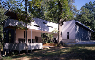
Radcliffe Bailey House


I was interviewing the artist Radcliffe Bailey for Paulson Bott Press, and the conversation drifted from art-making towards architecture and his house, which was designed by the noted firm Mack Scogin Merrill Elam Architects, Inc. I thought it would be interesting to share his thoughts and some of Tim Hursley’s beautiful images.

Interviewer: How did you meet Scogin and Elam?

Radcliffe Bailey: In Atlanta, the arts community is so small, and they were involved in a magazine and a museum. The magazine is called Art Papers. They were on the board. I went through like six architects, and I got tired of them bullshitting me, and I looked back at my notes and I said, oh, they’re here. So I just called them and went to meet them. I went in with my slides and showed them my work. And then they did their thing.

I didn’t give them any “I want this,” “I want that.” The studio that I had in Atlanta was about 7,000 square feet, and it was like a truck—an 18-wheeler could go through it, and I loved the space. So they came in and measured the dimensions—the width and ceiling height. And they came in with that space. I didn’t want windows. The Plexiglas comes right up under the rafters so the light bounces in. They just have this way of working that’s just like making an omelet. It’s like I commissioned them to do a sculpture.


Interviewer: So they just did a sculpture that you moved into?

Bailey: Right.

Interviewer: Did you even say, I need so many bedrooms, or I need a living room, or I’ve got so many kids?

Bailey: They met my family, and we just let them do their thing. You wouldn’t get the best if you just gave them all these restrictions.


Interviewer: Does it feel like the house is an extension of you?

Bailey: It does. It changes during the seasons. I can set it up in different ways where I can get closer to the studio. But also there are days when I won’t go in the studio.

Interviewer: But are you still making art even if you’re not in the studio?

Bailey: Yeah, I am.


Interviewer: Where is the house located?

Bailey: It’s on Civil War ground. There’s a road that went to a mill, and the troops camped out in these woods. So it was never marred.

Interviewer: Do you spend most of your time in your house then? Or do you travel a lot? I always think if I had a great house like that, I would never leave.

Bailey: I have a hard time being there by myself.


All photos courtesy Mack Scogin Merrill Elam Architects and Timothy Hursley, Photographer.