 |
| Dan Flavin at Michael Kohn Gallery |
I spend a lot of time thinking about and planning travel. Many of the trips don’t come to fruition, but my online history (if I could find it) would tell of this obsession more than of any other. Hotel websites, travel agencies, and, of course, VRBO. What drives this? Seeing friends, observing different cultures, and of course experiencing architecture that I have seen only in photographs. But there is something else. The search for a deeper sense of home. As if there is some place in the world I actually belong, really belong. What if it’s not here? I just read that Armistead Maupin, a writer whose identity is largely tied to San Francisco, is about to move to Santa Fe.
When I drive through my hometown a few times a year, I feel like I almost belong—well, except for the fact I can’t afford a home there. I remember riding (and walking) my bike endlessly up and down the hills, stealing kisses in the local cemetery (where my parent’s ashes are now buried), and buying licorice from the five and dime that featured a Dutch door with a bell that rings still.
There are several places that I have visited frequently for a variety of reasons that almost feel like home because they are so familiar. The British countryside, New York City, Seattle, Tucson, Palm Springs. Whenever I go to those cities, I pick up the real estate magazines at the supermarket or look into windows of real estate offices where photo ads are posted. At the end of the workday (when is that?), I look online to see where the bargains are. If an especially fine architectural gem pops up on Curbed, I post it on Facebook. (Los Angeles seems to have more of these than any other city.)
Besides the Bay Area, the only other place I ever called home was Los Angeles in 1989 and 1990. First I moved to Silverlake near Sunset and Silverlake Boulevard in a two-bedroom apartment with a view of the Hollywood sign. It was the largest apartment I ever lived in. The neighborhood was still pretty funky back then. Sunny weather makes everything look a little better at first blush. I chose the neighborhood in part because it held so many modern architectural gems that I wanted to call my neighbors. One day I was admiring a Schindler apartment house, and the owner invited us in.
When things were going well there, I thought I would stay a long time and bought a condo in Robert Alexander’s Baldwin Hills Village, known as Village Green. It was like living in a park. I had a private garden, a fireplace, and views out across expansive lawns. In the middle of Los Angeles, I couldn’t see a single car. The big brilliant land planning idea was Clarence Stein’s, and it worked. Village Green was an integrated middle- and working-class community where folks got along. I loved my little cottage. It felt like home in part because of the climate. Nobody likes the air pollution or the traffic in LA, but I felt comforted by the warmth and the light. With trees all around, you looked up and only saw blue.
 |
| A cottage at the Village Green in Baldwin Hills. courtesy: villagegreenla.net photo: Luz Anderson |
Los Angeles doesn’t have the humidity that you find on the East Coast or in the tropics. But in the late 1980s, there was a lot of violence and a sense of danger, as if Raymond Chandler was directing an epic performance piece. Three people I met casually in those few years were murdered. But it was the race/class divide that I felt most intensely. After a car accident that was a set-up for an insurance scam (and a few other issues), I got spooked and returned to the Bay Area.
 |
| A Raymond Chandler moment |
In the twenty-plus years since I left LA, there have been some significant urban changes, but not as many as you might think in a city known for reinventing itself. Downtown finally came into its own. The unfortunate development trend created by the Harbor Freeway cutting through downtown has been mitigated. The decades of economic depression along Broadway supported historic preservation—through benign neglect. By the time a new, young generation woke up to the beauty of the old office buildings, they wanted to live in them. There still aren’t enough places to shop, but at least people now reside downtown. The area around the convention center and LA Live looks like a wholesale transplant from Disneyland—or its naughty sibling, Las Vegas. But LA Live appears to be helping the Figueroa corridor and offers the bleak convention center some sense of place.
 |
| LA Live brings Disney street life to downtown LA photo: Gensler |
As predicted, the region’s congestion has resulted in nodal development. You hear people talking more about how they don’t leave their neighborhood much. Folks who live east of Fairfax lament going to the “Westside,” and vice versa. You would think a trip to the beach was a holiday involving airplane travel. Atwater is one of those villages not far from gang violence but sprouting chic boutiques and fine ethnic restaurants. Larchmont Village and La Brea both have a selection of high-end one-off shops and eateries.
My buddy John lives in the Hollywood Hills not far from the famous “Bat cave.” He commutes to the studios that are only a mile away. Coyotes threaten the pets and the neighborhood organizes. Down the hill, Franklin Street used to be home to junkies, but now sports an almost-chic hotel where I wouldn’t have stayed ten years ago. In the early 1990s, John walked into the supermarket and found everybody lying on the floor. He had entered just after a man with a sawed-off shotgun had departed. But you don’t hear those tales so much, as crime has moved elsewhere.
 |
| Bronson Canyon, where the coyotes threaten the kitty cats. |
The riots were the culmination of the anger I experienced, but the strife has not come again, or not so visibly. Not far from John’s house, Hollywood Boulevard finally had its own renaissance of sorts with the construction of a new hotel, the new home of the Academy Awards, and, of course, a mall. But like LA Live, it doesn’t feel very authentic. More like a huge plastic Band-Aid. Although a number of neighborhoods are safer and more secure economically, one area that seems worse off is Westwood. I remember it felt like a younger version of Beverly Hills, and now it just feels out of gas, forlorn.
The Getty was the most significant architectural addition to the city in the 1990s, but it didn’t create any new urban form. The cultural acropolis is based more on the Disney model—fantastic, secure, and removed. Speaking of Disney, the concert hall named after the family is the major landmark of the new century. And from at least two sides, Frank Gehry’s sculpture is splendid and contributes to the vibrancy of the street. The photos make it look smooth and perfectly machined, but up close you can see the metal panels overlapping each other, and I like that. That is the symbol of LA. Glitzy in the photo, but scrappy in real life.
 |
| Getty Museum courtesy: getty.edu |
 |
| Disney Concert Hall brings a live street to downtown LA courtesy: laphil.com |
Los Angeles is thought of as a horizontal city, but in a weird way it can be claustrophobic, because the city doesn’t really ever end until you reach the ocean. The best parts of the city are the private or semiprivate realms. The courtyard concept expanded over an entire megalopolis. One exquisite small private realm that I had never seen before this recent trip is the Asia Pacific Museum in downtown Pasadena. Two other nearby museums, the Huntington and the Norton Simon, are large semiprivate realms. This one is intimate, a group of rooms around a small, beautiful, Asian-themed courtyard. My friend Kristina had a show in an upstairs gallery. In the next room were dozens of children having an art lesson. This museum had three coordinated shows about woodblock printing and its influences. Even on a modest budget, they put together thoughtful, evocative exhibits. And they have one of the best museum gift shops anywhere. (www.pacificasiamuseum.org)
 |
| Courtyard at Asia Pacific Museum |
Continuing the theme of extraordinary private realms, we stopped off at the Ace Gallery on Wilshire, the largest private gallery I’ve ever been to, with a warren of little rooms between epic spaces. Typically it has multiple shows going, and now there is just one disappointing show of Ed Moses’s new work and a dark room in the back with an enormous Carl Andre metal piece. Down the street at LACMA, we stopped into to see Chris Burden’s “Metropolis II.” Later at dinner, a friend of mine said how much he hated it and wished they had left Burden in the storage locker he imprisoned himself in years ago. We laughed, but I countered and said the piece brought back my deep love of Matchbox cars and imaginary cities that we built in childhood. The roar of Burden’s little cars swooshing around enlivened the whole ground floor of the new Renzo Piano building. Sounded a lot better than that Bruce Nauman piece, which was kind of dull by comparison. And the kids in the museum were mesmerized.
 |
| Carl Andre at ACE |
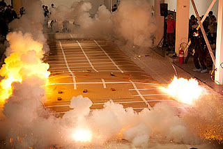
On Sunday, we went down to the Temporary Contemporary, or the Geffen as it is called, because he paid for it. We wanted to make it to both MOCA locations downtown, but we never have enough energy for both. There was a huge land art show taking up most of the building. There were some great films, but it seemed like a show about art, not the art itself. And it paled next to the explosion in the other wing of the building; Cai Guo-Qiang’s fireworks. Spectacle versus Contemplation about Contemplation. Spectacle wins.
 |
| The Geffen Contemporary aka The Temporary |
 |
| One of my favorite pieces at The Ends of the Earth show. An installation by Patricia Johanson Stephen Long |
 |
| Let's blow up a museum. Cai Guo-Qiang at the Temporary. Ignition of Chaos in Nature, Los Angeles 2012 photo: Joshua White courtesy: The Museum of Contemporary Art, Los Angeles |
But of course, that’s what I love about Los Angeles. It never makes sense, and I leave confounded.


