 |
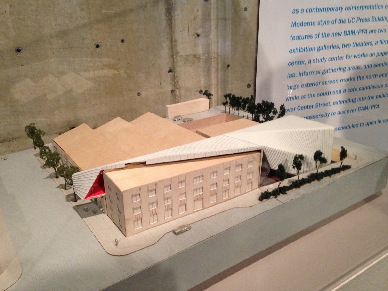
| New model of Berkeley Art Museum by Diller Scofidio + Renfro |
Sunday, December 21, 2014, was last call for the Berkeley Art Museum. The fan-shaped concrete structure swept this boy off the street and held him for a long time. Mario Ciampi’s building from 1970 was full of surprises for a 12-year-old and still offers delight for the 56-year-old. Stairways, ramps, elevators, light, and concrete provided an excellent background for art that was confounding, challenging, and inspiring.
 |
| Bancroft Avenue elevation |
Our parents were not especially adventuresome, but they did take us to New York, DC, and Montreal in 1967. The visual wonders of that trip have stayed with me forever. And a few years later, they took us to the new museum in Berkeley, where we saw Claes Oldenburg’s melting plugs and soft food. My parents were measured in their comments, not wanting to influence us one way or another. Having seen the Guggenheim’s fantastic spiral on our trip a few summers before prepared us for a building that was all about space and light. Some of the art we saw back east also got us ready to see everyday objects anew, but maybe didn’t prepare us for pop art that was so soft, so sensual, so real.
 |
| A few Hans Hofmanns http://www.bampfa.berkeley.edu/exhibition/hofmannbyhofmann |
A few years later, in high school, I made dozens of visits with friends to the museum (it was free for students!) and spent a lot of time with the Hans Hofmann paintings, which were then in the top floor gallery. I hadn’t read about his ideas about push and pull and planes, but I was overwhelmed by the sharpness of his colors. One piece, just one shade of flesh pink, was easier to look at because his exploration was so much simpler for my developing aesthetic. It was here that I saw my first works by Helen Frankenthaler, Mark Rothko, and Sam Francis. All lessons in color, space, and meditation.
The Berkeley Art Museum took risks and filled in gaps. Some shows, like the Juan Gris exhibit, were traditional in their presentation but gave me a whole chapter beyond Picasso and Braque that I had missed. Other shows used the building’s architecture to great effect, like Robert Irwin’s light sculpture in 1979. More recently, in 2012, the Barry McGee show filled the center with graffitied vehicles and a clubhouse. Most of the visitors I observed were asking what all this junk was doing in a museum. For the Kurt Schwitters show, the museum reconstructed Merzbau, a fantastic environment that existed in the artist’s flat in Hanover. http://designfaith.blogspot.com/2011/09/art-mind-kurt-schwitters-and-create-at.html
 |
| Pals Yosh Asato, David Baker, and Bruce Damonte |
In the middle of the 1990 culture wars, Lawrence Rinder (then curator, now director) put on “In a Different Light.” It was not a show of gay artists exactly, but a show of gay sensibility organized around the themes of Void, Self, Drag, Other, Couple, Family, Orgy, World, and Utopia. Established artists and works from the collection were included along with emerging artists. It was a bold and brave step for a young curator. http://www.bampfa.berkeley.edu/exhibition/InaDifferentLight
Perhaps my favorite show was the Joe Brainard retrospective in 2001. He was inspired by both Schwitters and Gris. And he was fearless. His small, careful collages were controlled yet often erotic, while some of his sculptures, most famously his Prell extravaganza, seemed to explode fully formed. He passed away from AIDS in 1994. He often gave his work away to friends. While he had a critical and mischievous eye, his work always seemed to hold a message of love.
http://www.bampfa.berkeley.edu/exhibition/brainard http://queersage.blogspot.com/2012/11/i-love-joe-brainard.html
 |
| Stephen De Staebler thrones and ottomans left out in the rain. http://www.stephendestaebler.com/ |


No comments:
Post a Comment